How fun to be close enough to one of the HGTV homes to go look at it with your own eyes.
We
drove.
We
saw.
We
left.
…and not Uber excited I must admit.
BUT…there were some beautiful, a-ha moments along the way. Come with…
The outside was quite different than your typical florida home. The colors left me a bit gray. Not a happy come on in…the sun is shining kinda feel. Yet certainly sophisticated.
I was eyeing this coolio concrete table…too heavy to fit in my purse, but quite interesting none the less.
Oy. You can see where I tried to move it. embarrasing.
The landscaping was sad…I have no doubt it was fresh and happy when it was planted…but we are dry dry dry here. Oh….and hot. Does not make for happy palms.
Entering was interesting…you were met with a whitewashed rusty orange striped wall and loveseat with a gorgeous starburst mirror that stole the show …in that look at me look at me ,WATCH me do a split, kinda way.
Not hugely easy to get the fabric and paint to match. But they did it impeccably.
To the left was an lovely raw wood table. To the right just a coat closet.
Stepping down you see a *reading/drinking wine* area to your left. It housed not one…but two wine coolers. Two orange chaises and a great paper mache lamp we have seen around the web. As a matter of fact they had a lot of paper mache lamps in the home.
The bird print was a lovely focal point…as were the orange chaises…the only spot of color.
This whole area was one *great* room.
The dining area has that wonderful horse print I have coveted for, like, ever
Let me tell you…
it was beautifully framed in a shadow box type frame…and the actual print (mounted on linen) had water stains. Thatmade it look even more vintage!
I didn’t jump up and down at the kitchen. Small. Kenmore appliances. Medium grade cabinetry. Dark shiny granite. some nice, but dark, glass backsplash tile. Small but functional I imagine.
Gotta say…I didn’t see the green happening so much.
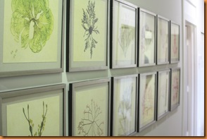
Ok…these I loved. Solar tubes (similar to a skylight but with less heat. ) amazing how much they lit a hallway!
This was in the master bedroom closet…
Master bedroom was certainly the biggest in the home…but not huge by any standards. Liveable.
The two closets off the master were curtained. A nice lined linen.
Different. Not huge.
But in proportion with the master bedroom,
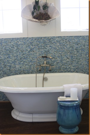
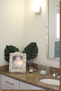
The bathroom, while appointed beautifully was lacking something…a little cold.
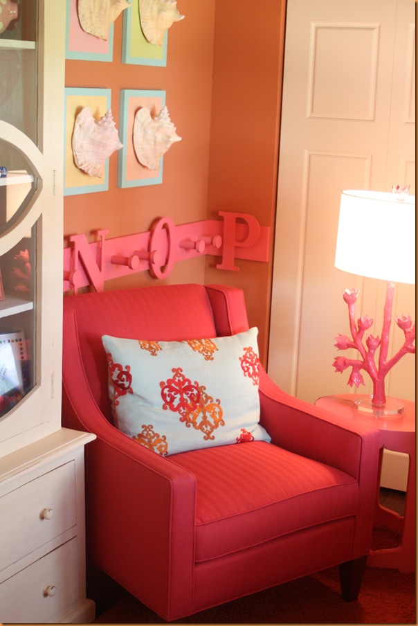
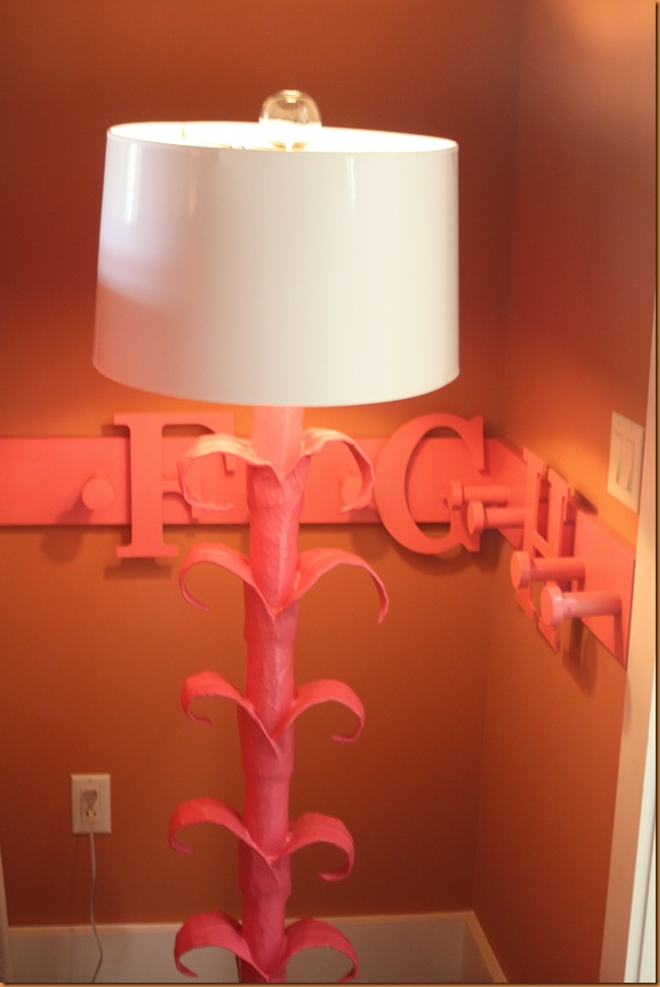
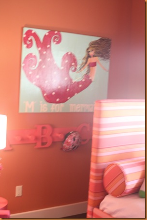
The other three rooms were particularly small…but decorated adorably! Great paper mache lights in this room…but you almost had to move the chair to get to the closet.
The outdoor room had some great
remote control screens that enclosed it from the buggiest of bugs
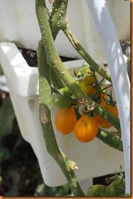
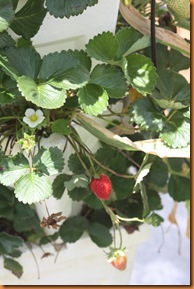
A small hydroponic garden in the back grows tomatoes, herbs, corn, strawberries and onions.
and...yep. I ate that strawberry right after the picture.
It begged me to.
The view across the street is a typical Florida development view. What it doesn’t show in all the pictures are all the empty lots that soon will be filled.
The town hall in the development…
So…there you have it. The good. The green. And the …well I’ll let you fill in the blank.
whad’ya think??
***Please excuse the poor formatting…wanted to give you some bigger pictures, but I’m not to smooth at Live writer yet (thanks Design ties for the tips!)













29 comments:
I'm afraid I'm not too impressed. The accent pillow in the master bedroom and that bird print were the two highlights for me.
In general it is disappointing but I did like the colors in the master bedroom.
Charla
Ooooo! I'm so jealous - even though some of the house definitely is not my style - that you got to see it in person. I saw the special on HGTV, and I have to admit I was mad about that table in the foyer! OOOOOOOOOOOOHHHHHHHHH I want it! SOOOOOO BAD! You think they'll notice if we walk out with it? We'll create a diversion. Scott will ask a bunch of questions - you can grab one end, I'll grab the other, and your hubby can drive the getaway van! :) LOL!
Funny you should post this tonight, Linda. I just took the virtual tour online last night at HGTV. I was thinking the same thing about the sizes of the rooms. I'm all for downsizing, but seriously--those rooms are SMALL! As with most showhomes, there are some ideas I can take away (like the awesome papier mache lamps!) and ides that I can leave behind (like the overall DRABness of the exterior.) Thanks for you pictures and commentary. It was fun to see it through your eyes.
thanks for the tour of one of my future homes...If I win it, I'll take it...only a short drive to Miami, I've done it... do you think the fact that my young niece and nephew live in Port St. Lucie will help with karma so I can win the house? ;)
I drove by that house today! You have made your own home so special. It seems like all the new ultramodern houses in this area lack warmth. Your house is so special compared to the typical cookie cutter in this area. Thanks for the tour. The highlight for me was the hydroponic garden. Looks like our local friends Dekker Farm's got in on that. Their farm is wonderful contribution to our community.
You probably saw photos of the back of my new house on my blog. The inside is going to need ALOT of decorating and renovation. You want to see the "as is" photos?
how funny..i was going to ask if you had visited this home yet...being so close to vero and all! well...its too decorated for my taste, too busy..but it was fun to see your pics after seeing the hgtv version! thanks for taking us along....
Since I'm a small(er) house person I don't take issue with the size of the rooms, but I am missing the sea..., not even a peak?
I like your new header :-)
Don't worry, it doesn't take too long to figure out Windows Live Writer :-) The best thing about it is that it inserts your photos right where you want them, not up at the top of the post. And the effects you can add to your photos are nice :-)
Thanks for taking us on a tour of the HGTV house. I like a lot of things about it -- the colours, the wood ceiling in the dining room, the great throw cushions, the artwork, the outdoor room... but it just doesn't really grab me. It feels a bit impersonal -- too much style and not enough substance, I think.
I would have eaten that strawberry too :-)
Kelly @ DesignTies
Didn't really inspire much in me. I liked the bed in the master bedroom though.
Jeni
Bridget...I found the art to be the best thing.I DID like that pillow on the orange chaise too!
Charla...I hear ya!
Artie...I loved that table. Naw, they wouldn't notice at all. Sounds like a plan!
Sharona...I say you start working on some paper mache lamps!
MsBliss..I think you are in like flynn!
Denise...one word...YES! i haven't been to dekkers. need to!
Anita...yep. spot on.
Maya...nope not even close to the sea. A pretend lake with a fountain in the middle is as close as you'd come. Sorry.
Kelly...Thanks again!
Jeni...seems to be the prevailing opinion. But I would take it if I won ;)
Slightly disappointing but some lovely accent pieces I would like to have;) thanks for the tour!French;)
Thanks for the tour Linda... how great that you got to see the house in person! I liked elements of it, particularly the use of colour in some of the rooms. I liked the grey kitchen cabinets (I don't think you were all that crazy about them) but I would have liked to see touches of colour in the space. I don't mind the smaller rooms - as long as they're functional. Small rooms are green because they require less energy to heat... besides, we just sleep (well... and a few other things. Ha!) in our bedrooms so they don't need to be monsterous. I'd prefer larger living-life spaces.
Glad you're using Live Writer :-) Your post looked great... and you'll be an old hand at it before you know it... very user friendly!
Cheers!
Victoria @ DesignTies
Thanks for the tour. I liked the wood ceiling - think it was in the dining room. Never heard of paper mache lamps before - interesting. Makes me wonder if you can make your own?
How fun to see a house like that. I love that concrete table. That's going into the idea file, for sure!
Thanks for the tour-I agree, I liked the Dream Home better than the green home, when we were up in the Bay Area, we took a drive through Sonoma and found the house-couldn't go in though....maybe they need a new interior designer for these homes...to excite us.
I tend to like colors and a design that is more traditional and classic. However, I did love the way the house used black...it created such a clean, crisp look. Additionally, I really like the idea of curtaining off the closet from the master bedroom. This is an idea that my mom just used in our vacation home.
Linda, send me your email address.
How fun to take the tour with you and hear your thoughts on it. I had a hard time getting a feel for the house from the HGTV photos. Your take confirms what I thought about it in general. I wasn't hugely impressed by any of it and liked last year's much better.
How lucky that you live nearby! Being familiar with the area.. the house impresses me - but not the area. Nice house - wrong location maybe? You're a great spy!
Well Linda,
Your great photos of the vignettes you chose make me like this house way better than anything I've seen on HGTV. They need to hire you!
I often wonder what I would do if I won such a house. Would I sell it? Auction off the stuff on eBay and start over? Afford to pay the taxes and upkeep ha ha?
Anyhoo, the paper mache is all from a company called Stray Dog (and it's made in Haiti). We carry it at the shop I'm working in now (perch-home.com). I love it, but not so many pieces!!!!
Thanks so much for being our eyes!
xo xo
You know I was writing you from work?
xo xo
Valorie (Visual Vamp)
The bathroom was too cold for my taste as well. It would have been so chic if they would have spread a little greenish yellow in little places. That would have sparked it up. Also...I just ended up rolling through the rest of your pictures...it is cool you could go and visit it. When they had the house in Sonoma I wanted to go but after I saw it on tv I thought...good thing I didn't waste my gas. I think it's time for them to bring in some new edgy designers.
Hmmmm, just hmmmm, there are some FABULOUS details, but overall I've seen much more creative green design.
Outdoor room, yes, love that and the little bits of color, but then, you know me and color!!
thank you for this tour!!
LOVE the blog header you chose, even though I did not vote for it! You take such great pictures you made this house look good! **blows kisses** Deborah
Not what I was thinking it would be!
Thanks for the visit!
Michelle
Zuniga interiors
Impressive or not....I'd live in it. Mortgage free!!!! Hey, Linda...come on over; we're having margaritas on my blog. Happy Cinco de Mayo! Arriba!
That was better than their show (which I turned off and deleted because it was just too long and boring). Thanks for the tour!
i think this is great !
you know i am wacko for the horse - art work.
xx
Post a Comment